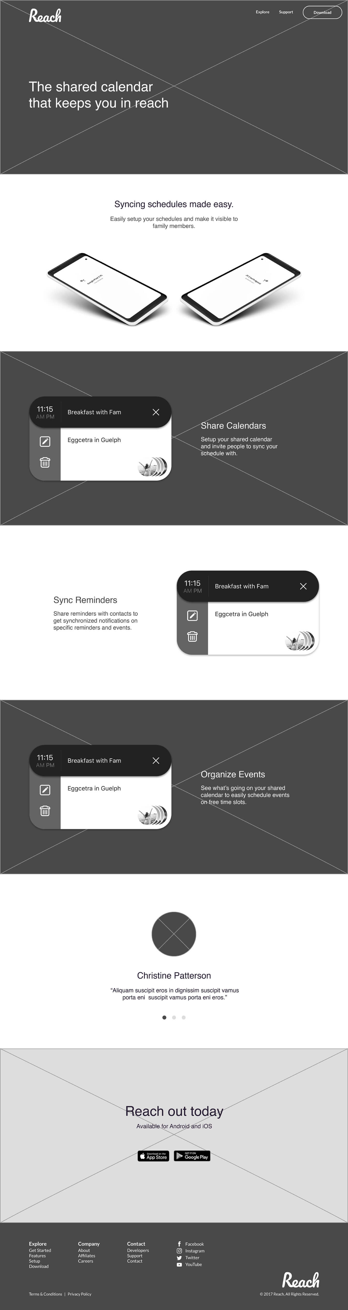
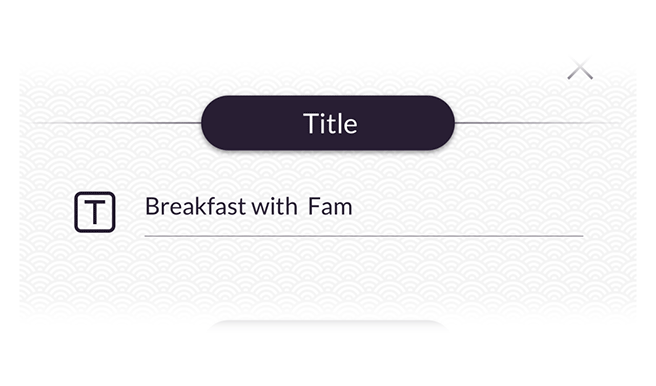
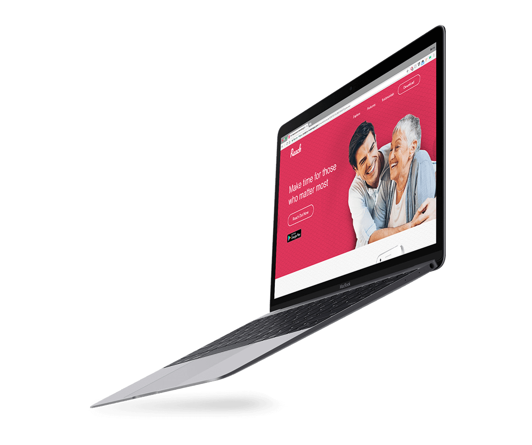
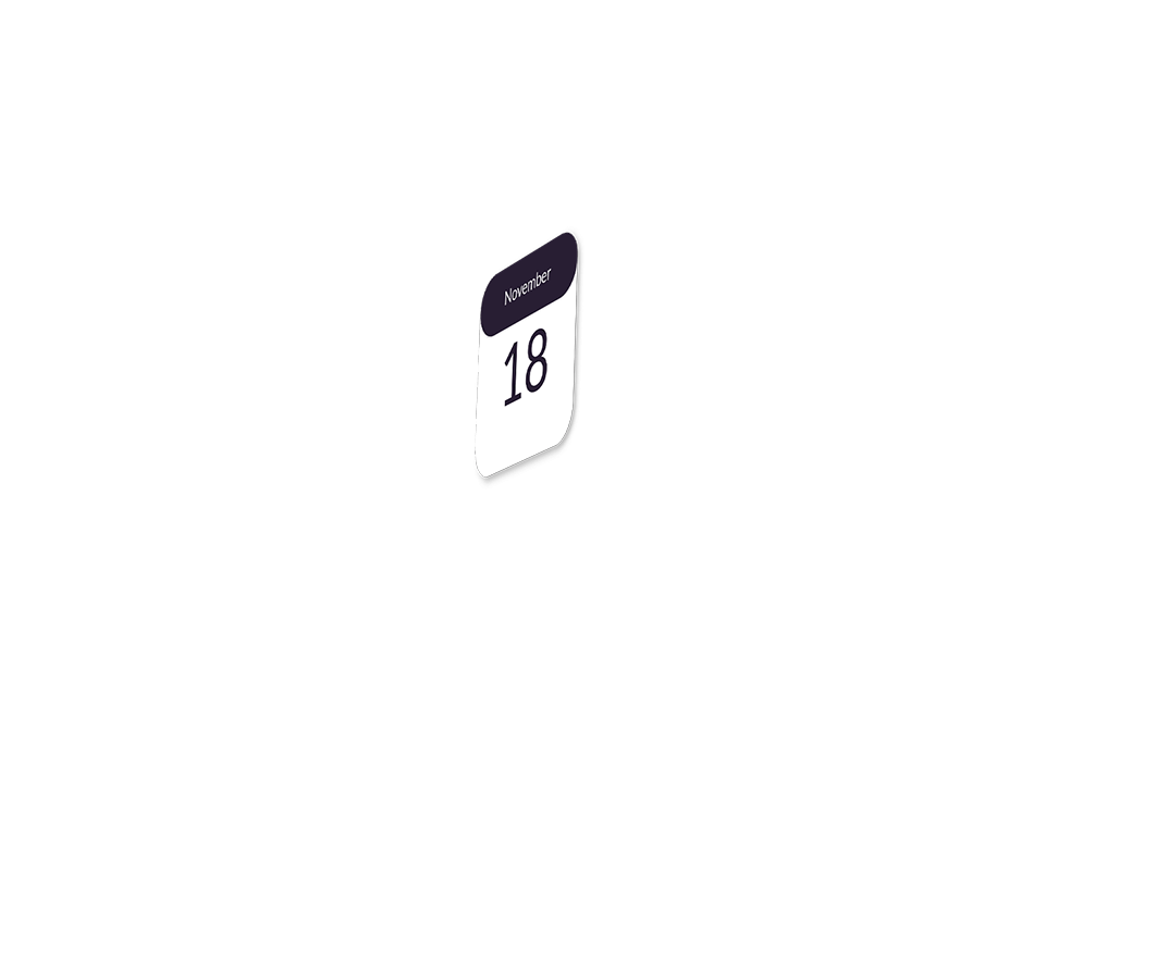
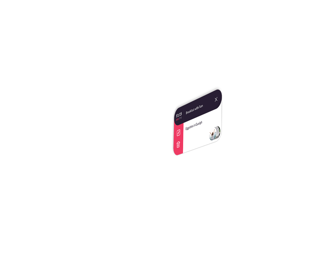
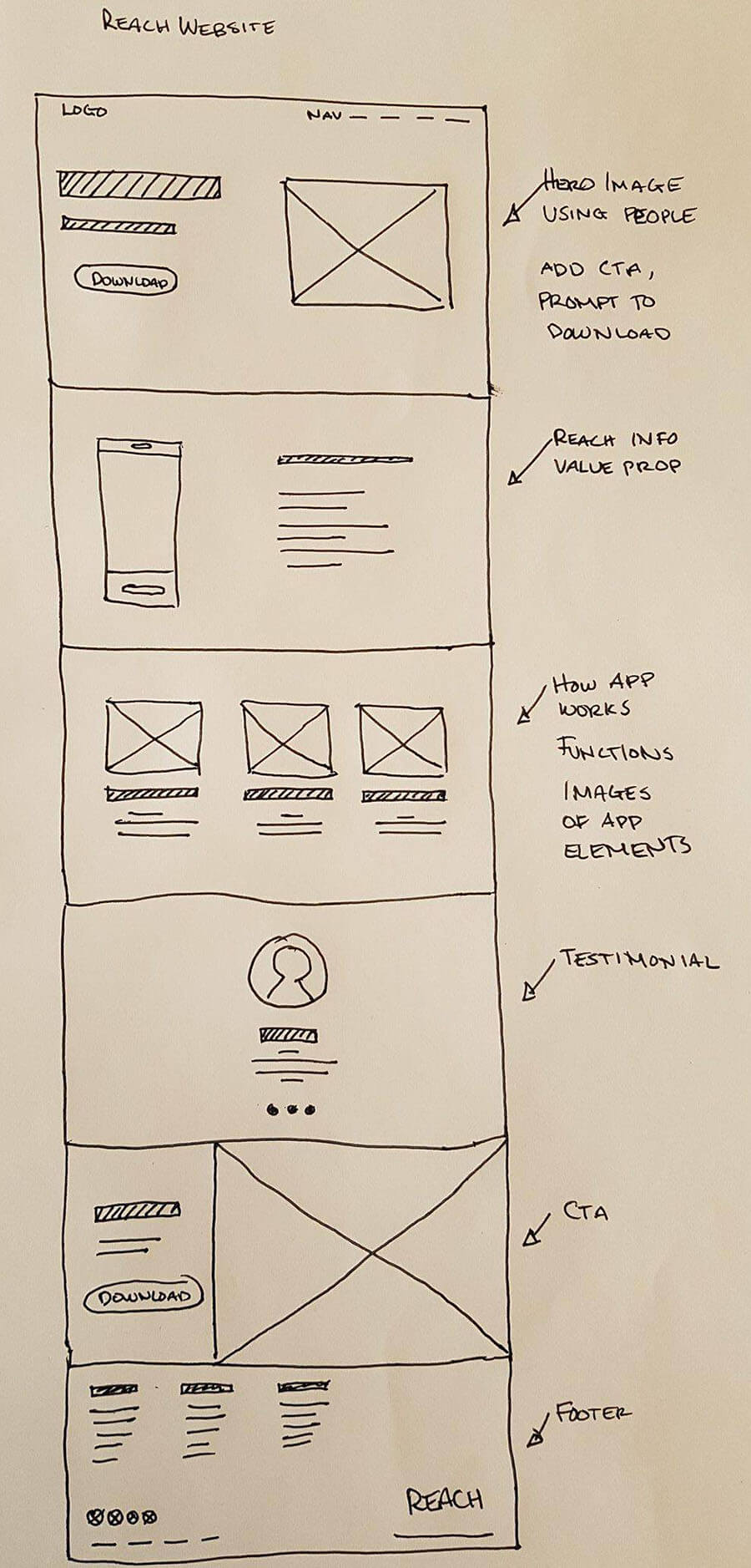
Hi-Fidelity Elements
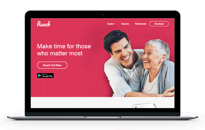
With the wireframes ready, I could start building assets. I didn't want to just use the images as is, I wanted the Reach brand to pop out of the imagery more. To do this I cropped out the backgrounds of the images of people and added the magenta background shown throughout the Reach app.